VIX
Stocks rose on February 5, with the S&P 500 gaining 39 bps to close at 3,886, with the VIX Futures dropping to around 20.9. That should be it for the VIX; maybe it drops to around 20, but skew and implied volatility levels are just too high to see it fall any further. It would suggest that the S&P 500 index is now at the top of the range, and perhaps a sideways grind may be due.
S&P 500 (SPY)
Additionally, the SPY had just about risen back to the trend line it snapped on January 27. Whether that serves as a turning point is hard to say. If the index were to turn lower, it would be a confirmation pattern of the broken rising wedge pattern. It would certainly make sense should it happen, but then again, the SPX should have turned lower when it filled the gap at 3,850, but it didn’t.
The testing of the trend line with the VIX at 20 certainly makes this an ideal place to see another 3-5% decline, possibly even a re-test to 3,700. But again, all you can do is be mindful of the technical rules. It doesn’t mean they always work the way they are supposed to or the way we want them.
Ideally, one should want to see a pullback because it would likely increase the VIX enough to give the S&P 500 the juice it needs to rise above 4,000. Without it, it may just be a slow grind.
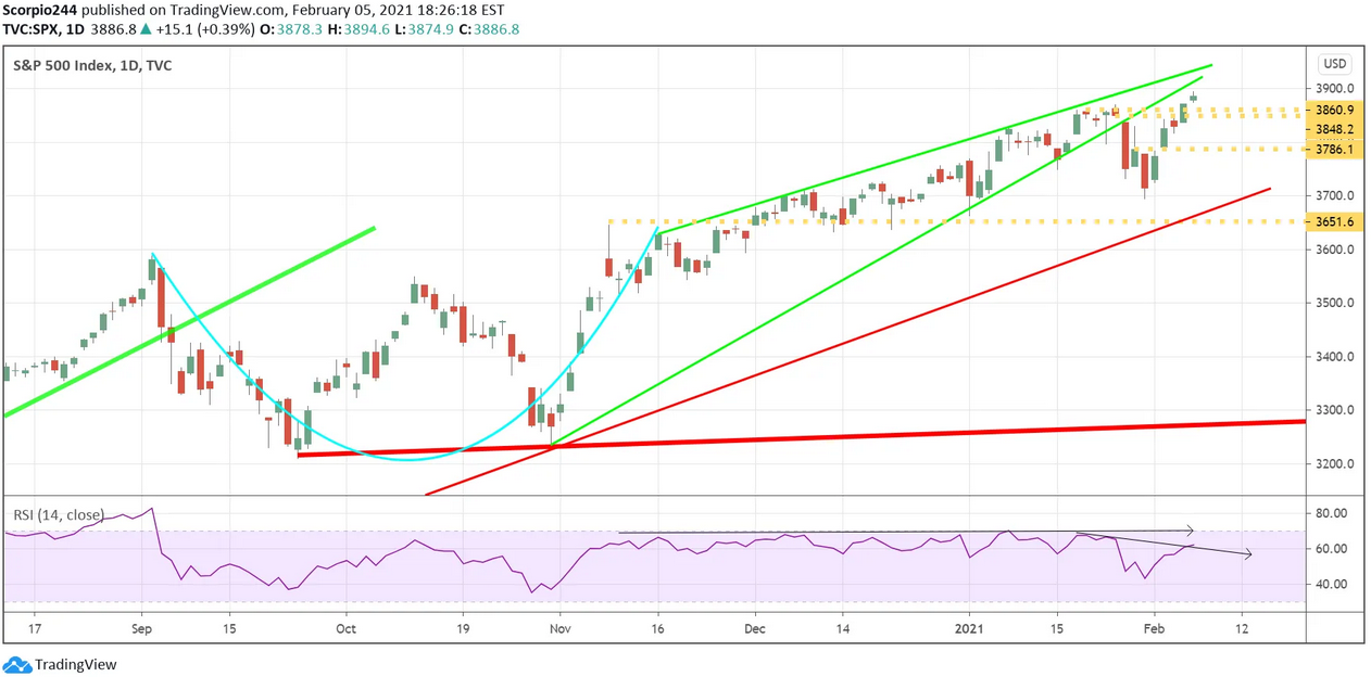 S&P 500 Index Daily Chart
Is it still possible for the index to burst up without a pullback first? Yes, should the VIX fall through 20, which I think in this environment isn’t likely, it could create a massive move higher in the S&P 500, potentially well beyond 3,950.
Most Shorted
In most shorted names, the party continued with the index up another 1.3% on Friday. Looking at the most shorted index chart from a longer-term viewpoint, what I saw was rather stunning. The parabolic curve looked really familiar; then I realized it looked just like Bitcoin. In fact, throw in a 3-week lag, and they are nearly identical. An interesting look into the future, maybe?!
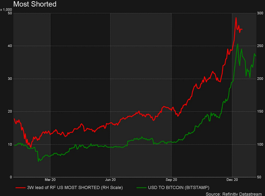 Most Shorted Stocks
Yields
The United States 10-Year rose again on Friday, this time to around 1.16%.
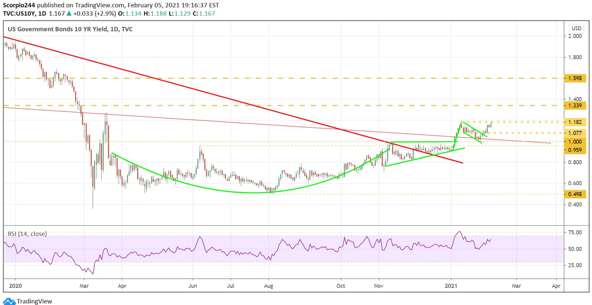 US Government Bonds 10 Yr Daily Chart
I know no one cares about rates, but they should. Relative to the 10-year yield, the technology sector is the most expensive it has been in at least 12 years. And as I mentioned in the subscriber section on Thursday, the S&P 500 has only been more expensive than the 10-year two other times in the past 12 years. The first time January 2018, the second time in October 2018. Do I have to tell you what happened next? Hey, these are the facts; this isn’t about being bullish or bearish. These are the facts. This goes directly to the argument that low rates are driving higher valuations. Even accounting for the low rates, stocks are no longer “cheap.”
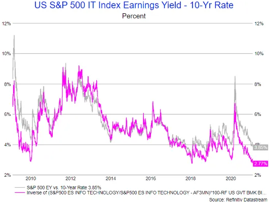 US S&P 500 IT Index Earnings Yield – 10-Yr Rate Chart
The other problem, the higher rates go and the higher stocks, they become more expensive at an increasing rate, like two trains heading towards each other.
Roku
Roku (NASDAQ:ROKU) has an interesting little setup; one takes the stock significantly higher towards $550. The other takes it lower back toward $300. At this point the RSI and Volume are both trending lower, which means the path towards $300. But I would think if you can get a move above $450 early next week, it opens the door to $550.
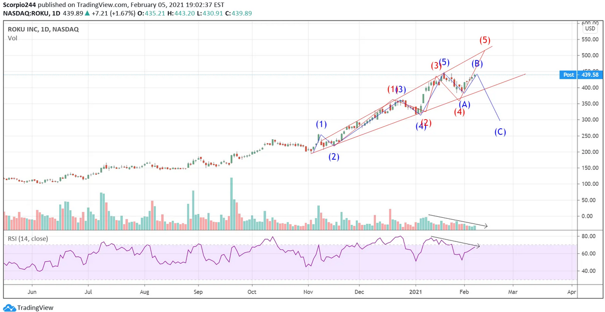 Roku Inc Daily Chart
