When the first exchange-traded fund (ETF) was launched in 1993, expectations were modest. The competition, after all, was the elephant in the room and had roughly a century to establish itself and dominate the industry. Nearly three decades later, open-end mutual funds still hold more assets than ETFs, but the latter long ago became a growth industry while mutual funds increasingly appear to be a sunset industry.
ETFs, of course, now offer a rainbow of choices across the major asset classes—and beyond. As a result, designing and managing portfolios entirely in ETFs has been a practical (and arguably superior) route for money management for a number of years. It’s not exactly clear when the asset allocation tipping point moved in favor of ETFs, which offer several advantages over mutual funds (tax efficiency, intra-day trading, for instance). But it’s safe to say that we’re well past the point of no return.
Recognizing the shift inspires a deep dive into modeling the ETF opportunity set writ large. This will be a multi-part series for CapitalSpectator.com and we’ll start with a simple big-picture recap of performance. For this screen, we’re looking at five broad buckets on a global basis: stocks, bonds, real estate/REITs, commodities and currencies. Within each of these categories the slicing and dicing will get granular in varying degrees.
Equities, for example, will pull in ETFs on a regional basis, country funds and various flavors of style and market-cap funds. For this installment we’ll leave out levered and short-strategy ETFs. We’ll also ignore funds with less than a five-year track record. In addition, to keep things manageable, one fund per category will be used (despite the fact that several alternative products often exist).
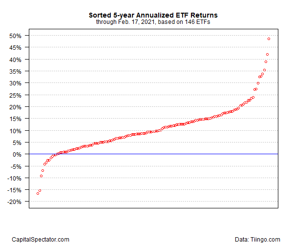
That still leaves us with a long list: 146 ETFs. Sorting this list on trailing five-year annualized total return (through yesterday, Feb. 17) dispatches a wide range of results—from a near-20% annualized loss up to almost 50%.
 Sorted 5-Year Annualized ETF Returns Chart
Most of the returns fall within the roughly 4%-to-15% range—the so-called interquartile range (25th to 75th quantiles that statistically represents the mostly likely performances in the group). The median return: 9.5%.
Note, too, that only a small fraction (about 8%) of returns are negative, which is to say positive performance has been the overwhelming bias in recent history. Losing money in ETFs over the past five years, in other words, has taken an unusual streak of bad luck and/or a deeply flawed trading strategy.
Another observation: the outliers delivered extreme results. For investors looking for high-risk, high-payoff bets, the ETF marketplace provided a fertile field for hunting.
Leave a comment