There are several disparities taking place in the market, and one of them has been the growth versus value trade. While it may seem like this outperformance can go on forever, higher rates may change that dynamic.
NASDAQ vs. Russell
For example, the NASDAQ 100 was historically high versus the Russell 2000 index for quite some time, but that gap has now completely closed in recent months as the Russell 2000 has surged.
In October, at a point, the NASDAQ 100 traded at its highest level to the Russell 2000 since the dot.com bubble in the year 2000. But not surprisingly, there has been a massive reversion, with the Russell now trading back to levels last seen in March versus the NASDAQ 100.
It isn’t that the NASDAQ 100 has fallen; it is just that the Russell 2000 has surged faster than the NASDAQ in recent months.
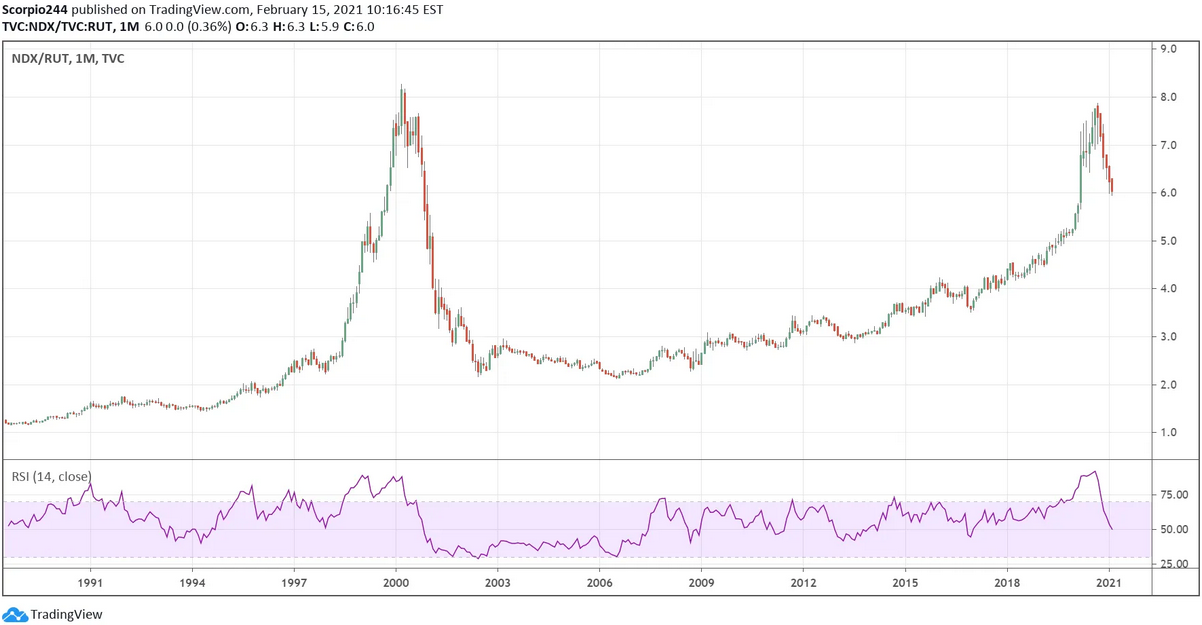 NDX/RUT Monthly Chart
Semis vs. S&P 500
We are now seeing a similar type of trade in the S&P 500 versus the SOX semiconductor index. The SOX index is currently trading at its highest level relative to the S&P 500 since the dot.com bubble in the year 2000. Again, an indication that the S&P 500 is likely to outperform the semiconductor sector going forward. Whether that means the SOX falls or whether the S&P 500 rises may not matter. What matters is that the SOX index may struggle compared to S&P 500 in the months ahead.
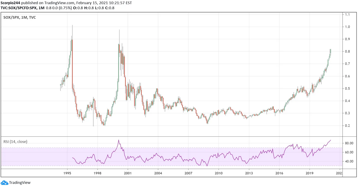 SOX/SPX Monthly Chart
Growth vs. Value
Growth stocks have also massively outperformed value stocks by a wide margin, based on the SPDR® Portfolio S&P 500 Growth ETF (NYSE:SPYG) versus the SPDR® Portfolio S&P 500 Value ETF (NYSE:SPYV). Growth is now beating Value by its widest margin since the dot.com bubble. Again, perhaps a sign that value is likely to outperform growth in the future.
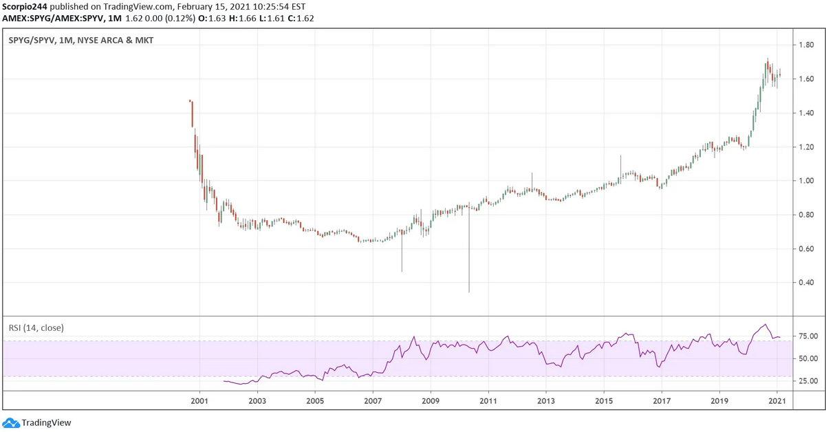 SPYG/SPYV Monthly Chart
The one thing each of these relationships has in common is the long underperformance period that followed. Whether that is about to happen again, one cannot know for sure. But if history is a guide, then the answer is yes, the growth and technology sectors are likely to underperform.
It won’t shock you to see that the S&P 500 Growth comprises names like Apple (NASDAQ:AAPL), Microsoft (NASDAQ:MSFT), Amazon (NASDAQ:AMZN), Facebook (NASDAQ:FB), Tesla (NASDAQ:TSLA), Alphabet (NASDAQ:GOOGL), and Netflix (NASDAQ:NFLX). Meanwhile, the S&P 500 Value Index is filled with Berkshire Hathaway (NYSE:BRKa), JPMorgan (NYSE:JPM), Walt Disney Company (NYSE:DIS), Johnson & Johnson (NYSE:JNJ) and Bank of America (NYSE:BAC).
Technology vs. Financials
In fact, the Technology ETF (NYSE:XLK) has massively outperformed the Financial ETF (NYSE:XLF), far exceeding its dot.com peak. Before the pandemic, the XLK traded for about 3 times greater than the XLF. Assuming the XLK traded sideways, the XLF would need to rise by 45% to $46 to get the ratio back to pre-pandemic levels.
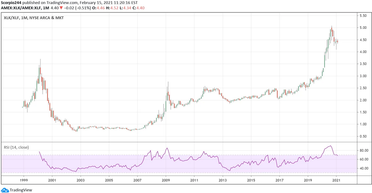 XLK/XLF Monthly Chart
The banks could be one group that really benefits if the economy continues to improve and yields continue to rise. The steepening yield curve could have further to climb, based on historical trends.
Regardless of the rate environment, a high rate period versus a low rate period, the spread between the 10-year and the 2-year has typically risen to around 3%. Currently, the distance is just 1.1%, which would suggest that rates on the long end of the curve still have plenty of room to rise, which could be a huge win for the bank stocks down the road. With 2-year rates, around 11 bps, it could imply the 10-year rises to about 3.1%, not that far off from the October 2018 highs of 3.25%.
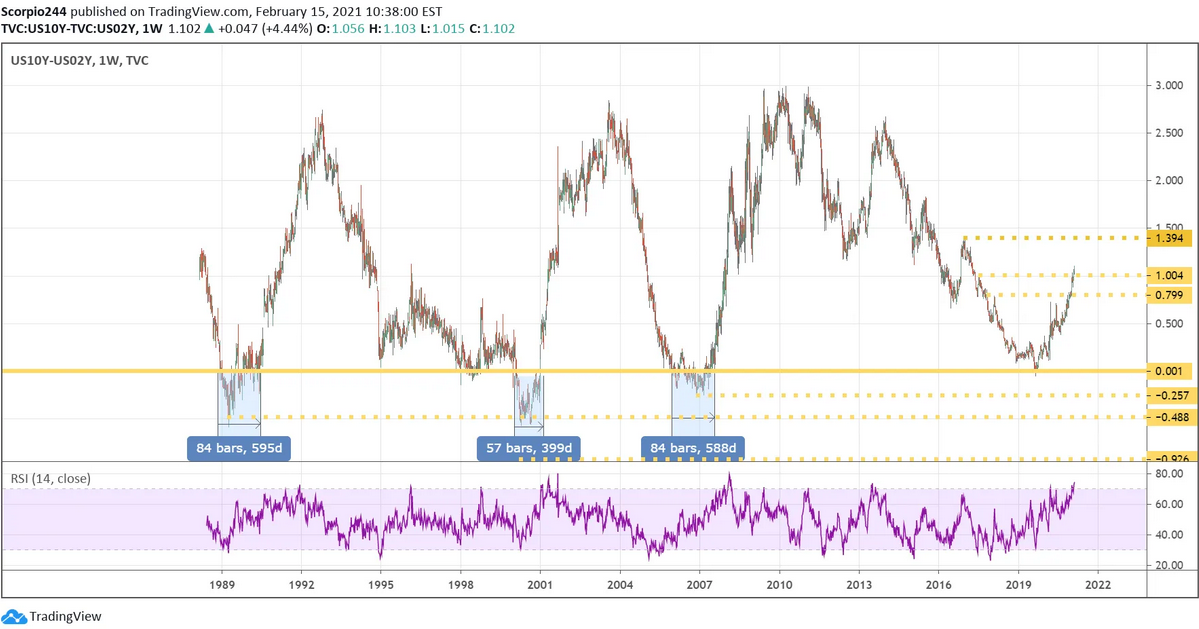 US10Y-US02Y Weekly Chart
The higher rate environment would likely be problematic for some technology stocks since much of their multiple expansion has come on the heels of low-interest rates. The S&P Technology Index is currently trading with an earnings yield of 2.7% versus the 10-year. At the significantly lower end of its historical range post-great financial crisis.
But if rates start rising, then the technology earnings yield will need to either start moving higher, meaning lower technology stock prices, or a more overvalued sector relative to yields.
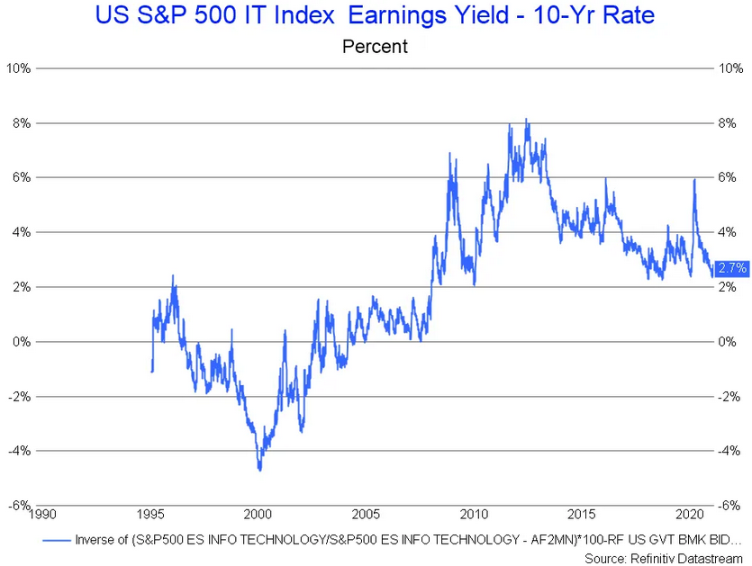 S&P 500 IT Index Earnings Yield Vs 10 Yr Rate
This is why I have been pointing to the current interest rate environment so much and why I have been talking for weeks that rising rates pose the most risk to the technology part of the market. At the same time, inflation data is likely to drive much of what happens next.
In fact, the 10-year started to break out on Friday afternoon closing above 1.2%, and could easily be on its way to around 1.34% its previous 2016 lows.
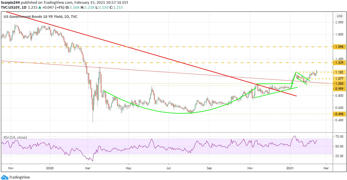 US10Y Daily Chart
We might start getting some clues this week with the producer price index.
Leave a comment