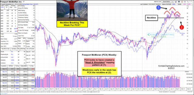
Freeport-McMoran Weekly Chart.
Copper and gold miner Freeport-McMoran (NYSE:) is in the middle of all things metals – and the economy.
As the economy heats up, tend to follow. And if interest rates and/or inflation ticks higher, tends to follow.
Over the past 18 months, Freeport McMoRan’s stock has risen sharply, reflected in this chart from Marketsmith.com. This has come as the economy has picked up, and an uptick in inflation has followed. But the stock’s price has begun to pull back and lose momentum. Will this be a sign of an overall slowdown?
Looking at the weekly chart of FCX, we can see that the stock’s slowdown has formed an ominous bearish head-and-shoulders pattern at (1). And price is now attempting to break below the neckline of this pattern at (2).
Further weakness would be bearish for FCX bulls and perhaps the broader economy and market. Will bulls step up and save FCX? Or, will bears feast on this developing weakness?
One thing for sure, this isn’t a head-and-shoulders top, until FCX can close solidly below the neckline – on a weekly basis.
Fusion Media or anyone involved with Fusion Media will not accept any liability for loss or damage as a result of reliance on the information including data, quotes, charts and buy/sell signals contained within this website. Please be fully informed regarding the risks and costs associated with trading the financial markets, it is one of the riskiest investment forms possible.

