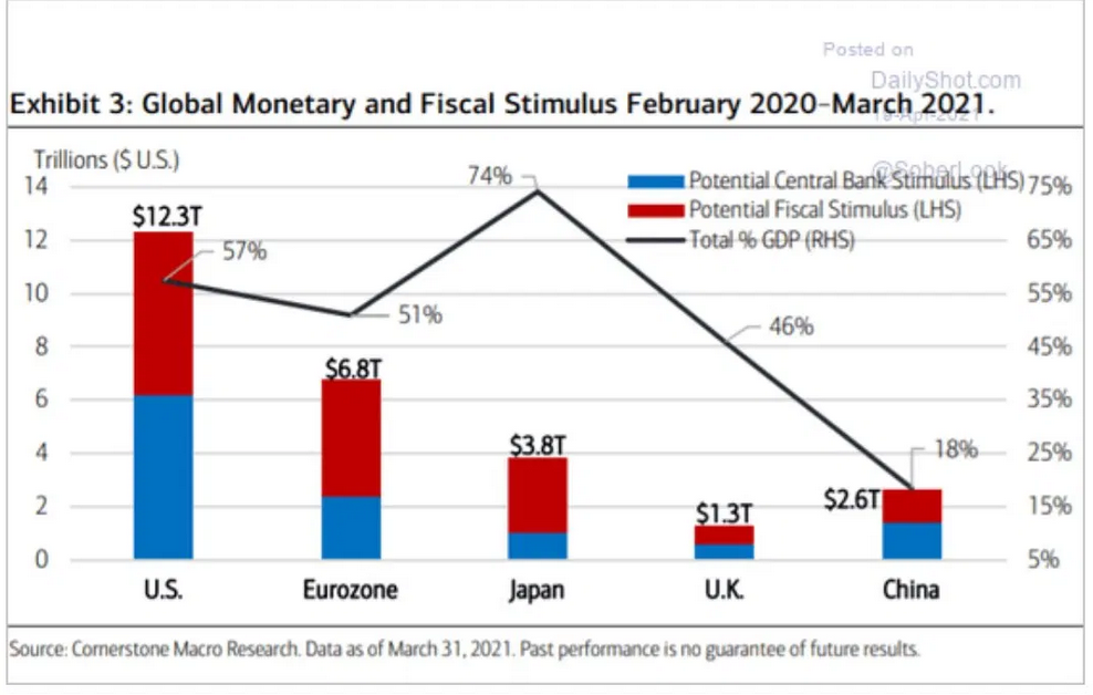
The amount of liquidity pumped into the markets and the economy in the last year dwarfs anything we’ve seen in history. Markets certainly have reacted to it with exuberance and the bounce currently seen in the economy is highly encouraging.
Enjoy it while it lasts for markets and the economy will soon have to contend with a new concept and that is: Relative tightening. No, not in the form of Fed tapering or rate increases. Those won’t happen no matter what the data says, central banks have already made that clear. To even discuss it would cause havoc in financial markets.
No, relative tightening is going to occur no matter what happens as the amount of liquidity having been injected won’t be repeated. The fiscal and political appetites won’t permit it. And while we may still see an infrastructure bill in some form this year everything that happens will be incrementally less.
Recognize that the amount of money pumped into markets is simply unfathomable:
In the US alone 55% of GDP, $12.3 trillion in just 13 months. There is no precedence for this. None. And consider the context: By the end of this year US debt will stand at $30 trillion up from $10 trillion in 2008. 66% of the US’s entire historical debt load will have been added in just 13 years. $20 trillion or 90% of GDP of debt expansion in just 13 years.
Keep dreaming it’s all consequence free.
To fully grasp the enormity of the cumulative size of the most recent intervention amounts: Did you enjoy your $1,400 stimulus check? Yea? What happened to the other $36,100? You didn’t get those? No? Cause for $12.3 trillion the total actually comes to $37,500 for every man, woman and child in the US (population 328M).
That’s how much was just injected into the economy and over the past 13 months.
You know it takes real effort to make rich really rich:
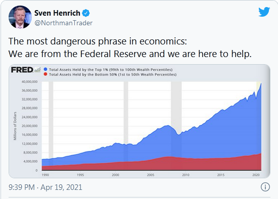
Total Assets Held By The Top 1%
Another way of looking at this chart above: Since just before the financial crisis the top 1% have added $20 trillion to their assets while the bottom 50% have added a mere $1.5 trillion between them.
With an asset appreciation of $21.5T between the 2 groups the top 1% took 93% of the gain. This is the result of a monetary system that is entirely focused on managing the economy with asset prices, the very assets that are owned predominately but the top 1%.
It’s been my contention that they’ve totally overdone it on the intervention front and as a result we’re staring at the largest asset bubble ever.
Yes the economy got hit, and yes intervention was needed in some form, but imagine the world has previously gone through shocks, even pandemics, and has managed to recover without all such intervention methods:
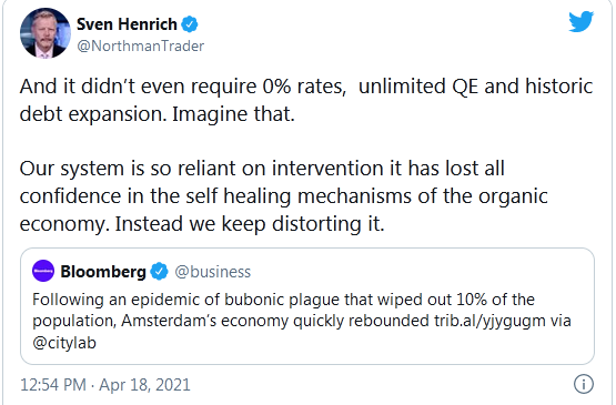
Tweet
But these are different times where policy makers have apparently zero confidence in the ability of an economy to heal itself without massive interventions, after all constant intervention has been the name of the game since 2009.
Now one could argue this period of peak liquidity is going to make way toward a healthy transition as the economy will recover with strong growth offsetting the relative less stimulus coming in and that process would then somehow justify the historic 200% market cap to GDP we are currently seeing. Maybe. But I submit that nobody knows what the organic economy looks like. But I can tell you it’s a lot lower than it is now. Take the stimulus checks away and will drop like a brick.
Same goes for all these fabulous earnings reports we will now see. Next year’s earnings growth will collapse on a relative basis. Perhaps not on an absolute basis but these year over year comparisons will start sucking wind and then this market, which has lived on multiple expansion for 3 years straight, will have to contend with reality. Question is when it will start thinking about it all.
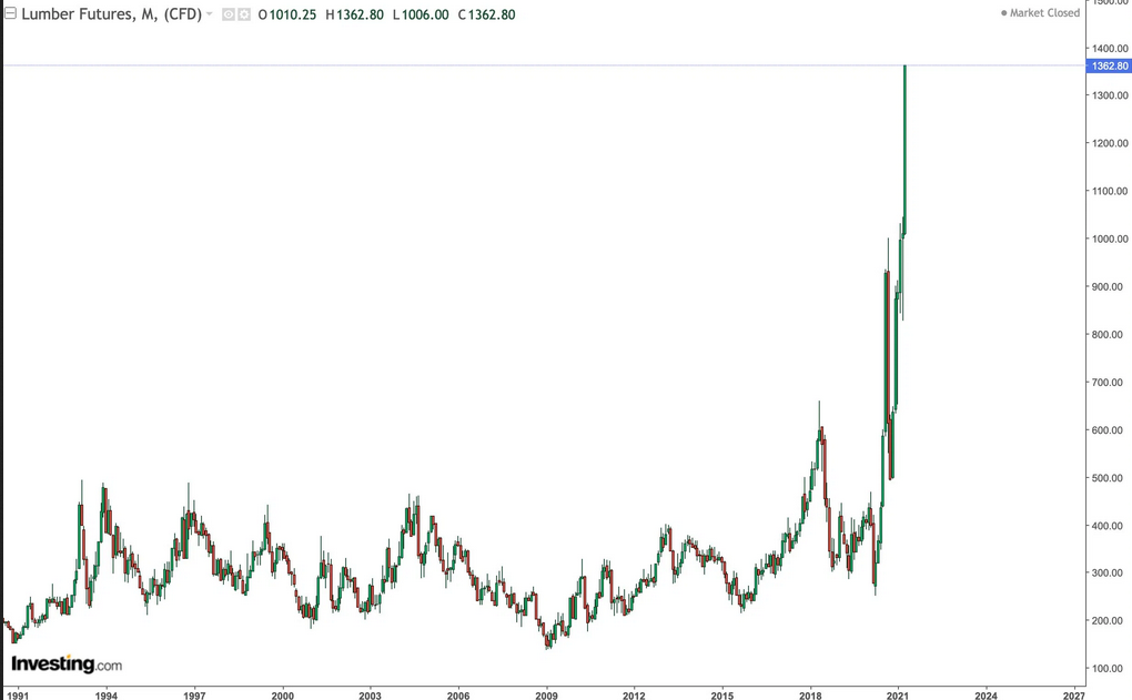
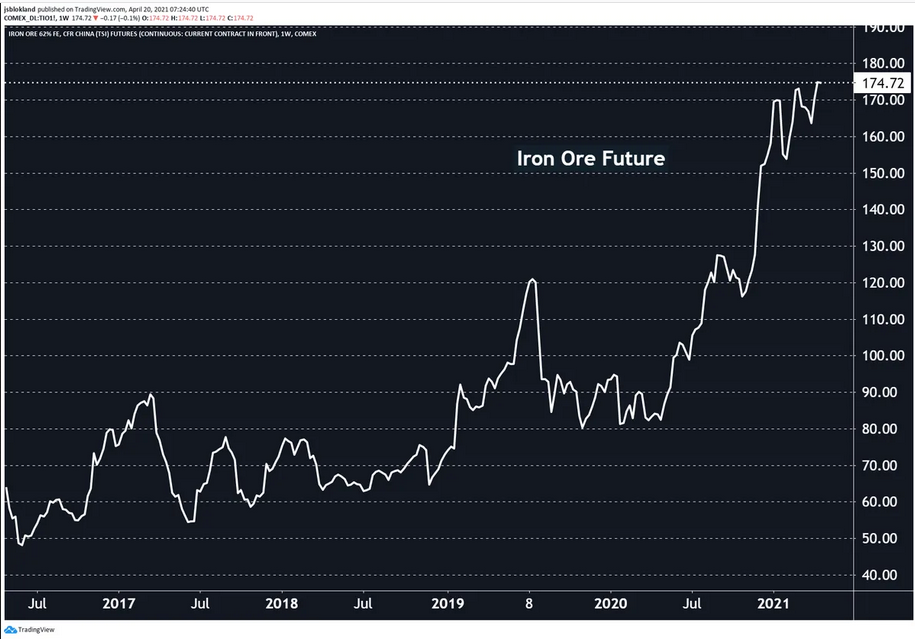
In addition the notion that creating $12.3 trillion out of thin air is consequence free is a complete fantasy. And while the theoretical consequences of all this debt creation is just that for the moment, theoretical, the real life consequences in prices accelerating vertically is already all around us.
Indeed we can stare at in awe as an example:
But it’s not only lumber is it? Take a look at :
We live in the age of universal vertical price acceleration where even an intended joke can reach a $50B market cap. Yes I’m talking .
Who knew one could ever craft a tweet that puts these asset classes together yet everyone gets the joke:

Tweet
This is the vertical casino you get when you flood a system with too much excessive liquidity.
The most vertical pile in into margin debt ever:
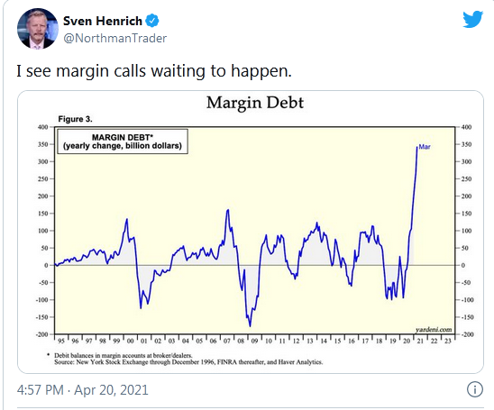
Margin Debt
Courtesy the loosest financial conditions ever:
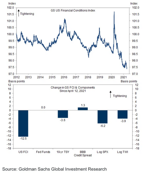
GS US Financial Conditions Index
I maintain the Fed is playing with fire and in their arrogance they are way too confident with their talk of “tools” to be able to contain inflation.
This entire market is so vertically bloated with excess across all asset classes and filled with speculative frenzy I see it as incredibly dangerous and this relentless drift higher in recent weeks and artificially produced calm could make way to something very sinister at some point. Nobody will ring a bell at a top and I certainly will not aim to make such a folly attempt, but I keep looking at market structures and charts and something is brewing:
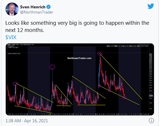
VIX Chart
This was posted last week as markets made new all-time highs.
Timing unknown. Indeed this structure could chop for months to come. But like its predecessors it looks to lead toward a major event to come. And by major I mean major drop your jaw volatility.
Notable here is that this week’s weakness in markets saw the structure firming with the bounce right off the trend line:
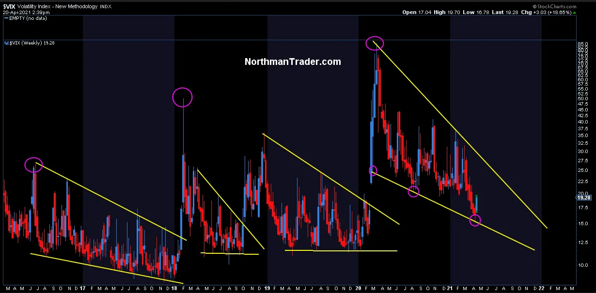
I’m not saying the chart suggests volatility is ready to blast off into high gear yet, it may take months, but it’s clearly building and as such it has room to move higher and continue to build out the pattern which also does not preclude new lows in the VIX yet to come this year either. These structures take time to build as we’ve seen in the prior years.
But what this chart tells me is that the loosest financial conditions ever won’t remain so, and that markets soaked with peak liquidity will have to contend with relative tightening at a point where expectations, valuations, margin debt and optimism have never been higher leaving room for major reversion risk.


