April tends to be a strong month for equities, and this month has certainly started off true to form. Lifetime highs are everywhere, and the SPDR® (NYSE:) is sporting seven green candlestick bars in a row.
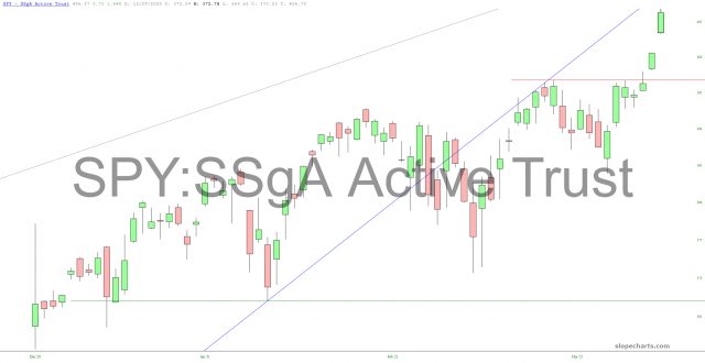
SPY: SSgA Active Trust Chart.
The iShares S&P 100 ETF (NYSE:) fund has a similar setup: a consolidation beneath that horizontal and then, bang, escape velocity. It could easily go another 1% or so before exhausting itself even briefly.
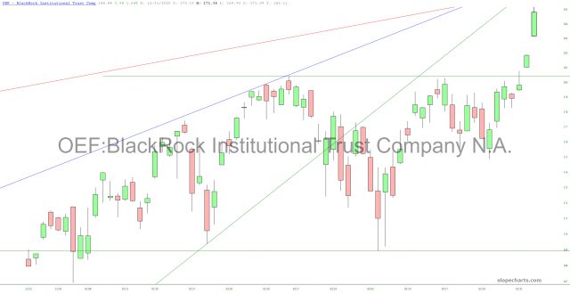
OEF ETF Chart.
For a longer-term view, just take a look at the SPDR® ETF Trust (NYSE:), which for months has either (a) made a new lifetime high or, alternately (b) taken a short breather. There’s simply no such thing as a two-way market any more.
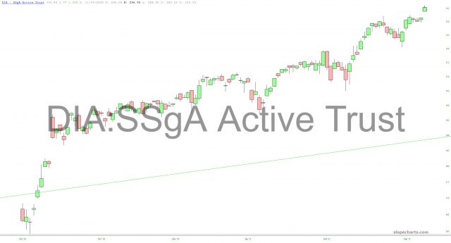
DIA ETF Chart.
I’ve got puts on the emerging markets, shown below, which seem to be treading water. A break below that horizontal would definitely get things cooking. The channel failure is still very much intact.
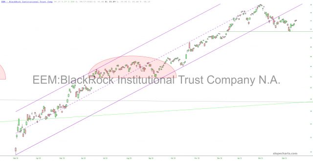
EEM Chart.
The small caps, likewise, have been range-bound for months. This has been in a fairly clean sine wave pattern, and it looks like it is time for another downward swoop.
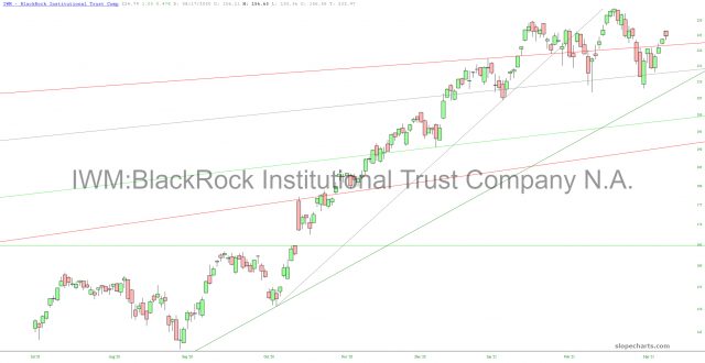
IWM ETF Chart.
I have been quite disappointed in the strength of semiconductors over the past week, which pretty much torched my diamond pattern, as I noted in a post earlier today. We are quite near lifetime highs on this beast.
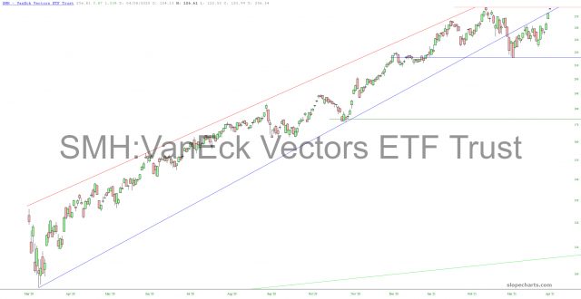
SMH ETF Chart.
has had a bit of relief the past few days, but I think it is just another in a long series of pauses (ever since Aug. 6) to precede yet another leg down. If gold’s performance is this lacklustre when the U.S. dollar is falling to pieces, you know that more pain must be in store.
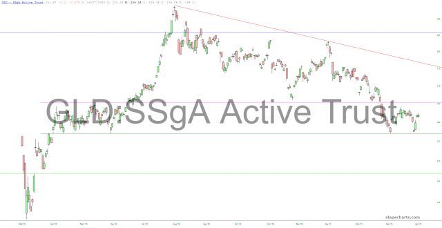
GLD Chart.
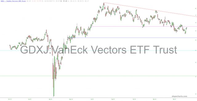
Should we take out the next horizontal in gold (breaking support), clearly the miners (including the juniors) are going to succumb to the strength of these big right triangle setups.
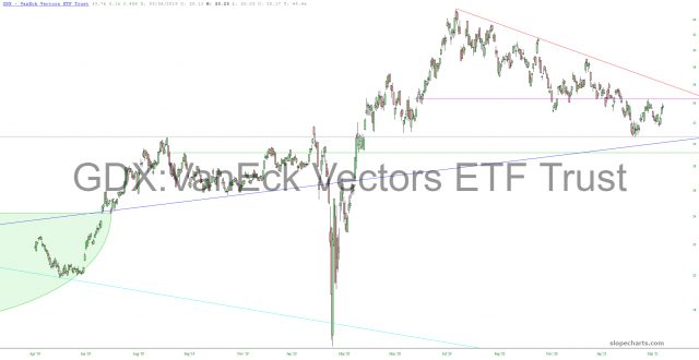
GDX Chart.
GDXJ Chart.
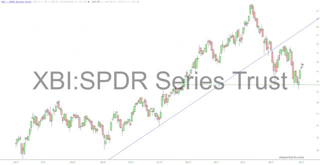
The biotech sectors, represented here by the SPDR® S&P Biotech ETF (NYSE:) fund, is about 95% done with the formation of its head-and-shoulders top. That horizontal I’ve drawn is a clean neckline which, if broken, would signal a sharp move lower.
XBI ETF Chart.
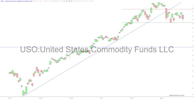
, like gold, seems ready for a hard break. Those horizontals cleanly define the range, and I am leaning toward a failure of the lower boundary, which would complete a small but squeaky-clean topping pattern.
USO Chart.
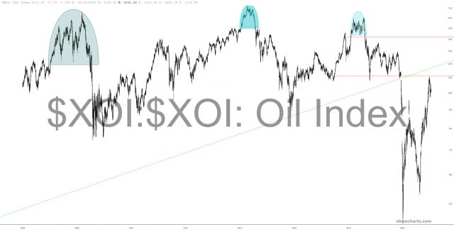
This would line up nicely with my view that a multi-month bear market in energy stocks in on the way.
XOI Chart.
Lastly, volatility has been beaten to an absolute pulp. We are lower than at any other time in the COVID era.
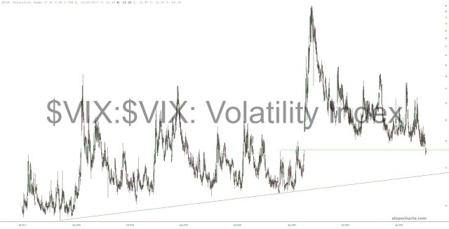
VIX Chart.

