-
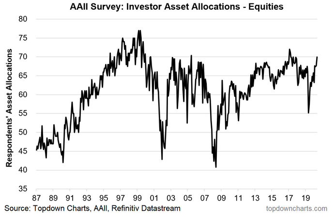
Equity allocations have surged to a 2-year high.
-
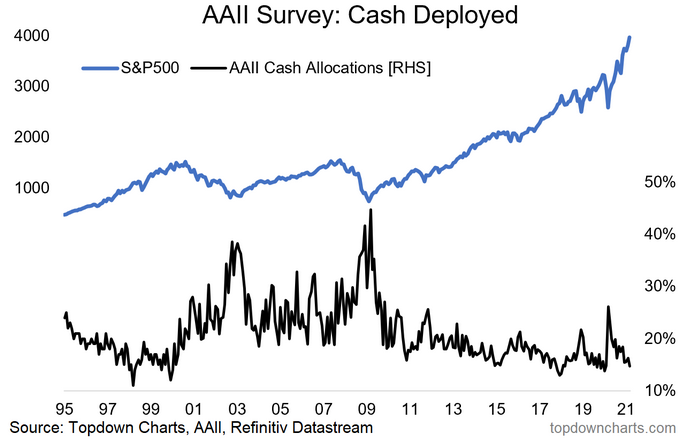
Cash allocations have dropped to the bottom end of the range.
-
(Yet) cash *levels* have not changed much at all…
-
One way to put it is that we can say investors are now “more-in“ but not quite yet “all-in“
This post expands on chart no. 4 from last week’s S&P500 ChartStorm—see below. It shows surveyed allocations by individual investors. After plunging to a 9-year low of 55% in March 2020, it’s back to a 2-year high of 70% in March 2021 (which compares to the all-time high of 77% in March 2000).
The chart uses data from the AAII (American Association of Individual Investors) Asset Allocation Survey. Aside from equity allocations it also tracks cash and bond allocations, and in this post I actually want to hone in on the cash side of things.
Cash Allocations: Cash is Trash?
In March last year cash allocations peaked at 26% (for reference we saw similar move in 2 other real money datasets, basically confirming this surveyed data). The March reading came in at 15% …not quite at all time lows (which was 11% in March 1998), but right at the bottom end of the range.

It’s important to note before we jump into the next chart that cash allocations can change for active reasons or passive reasons…
Active reasons: investors decide to undertake a transaction to change the level and allocation of cash within their portfolio e.g. “I am going to raise cash by selling equities and bring my cash allocation up to x%.”
Passive reasons: sometimes referred to as portfolio drift, when market movements take you to a new allocation % without you doing anything.
(but) I think it’s important to highlight that an investor can still be making an active decision by tolerating portfolio drift e.g. market movements take them to a higher equity allocation and they are ok with it… in other words, they could run a higher cash allocation/level if they wanted to but they have decided to just go with it.
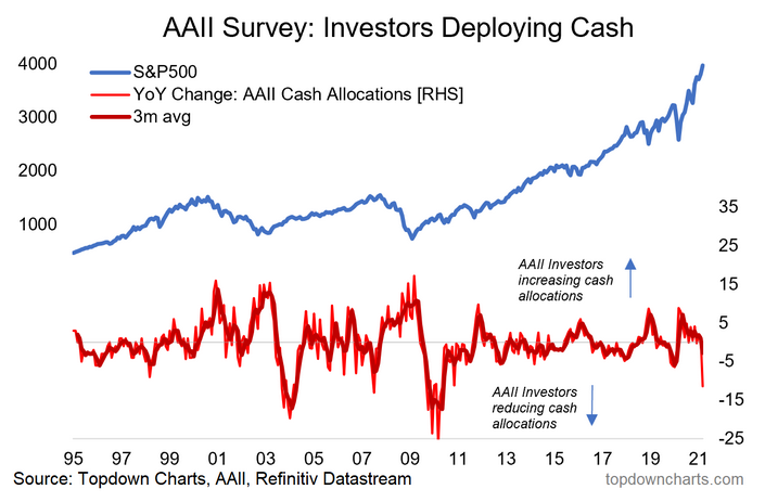
Understanding this helps us to have proper perspective in gauging the signals in the next chart. This chart shows the annual rate of change in cash allocations: conceptually it’s a rough way of tracking whether investors are raising or deploying cash. Obviously base effects are an issue at the moment, and portfolio drift is also clearly a key factor… but if we assume there is at least some level of active decision making in letting allocations run we can say that the chart is telling us investors are happily running down cash allocations.

And just one more data point to round it out…
Cash *Levels*: Cash is Flash?
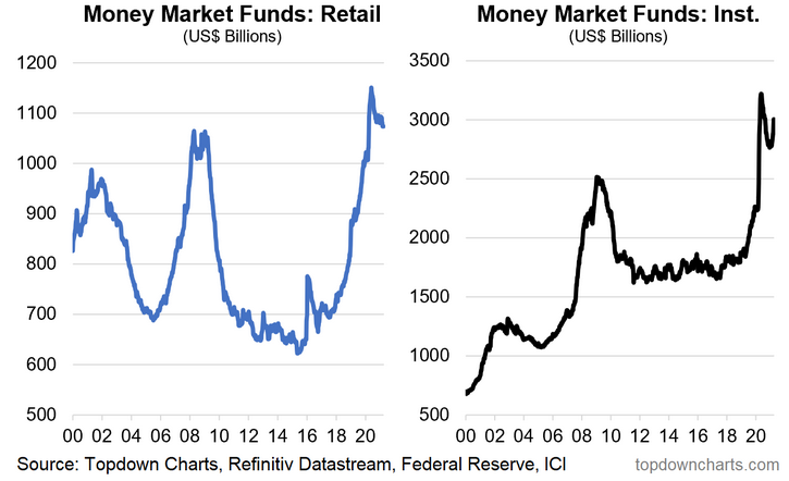
The next two charts show cash parked in money market funds by retail and institutional investors. The interesting thing to me is how cash *levels* have not changed that much.
Consider 2009: cash allocations fell substantially—market movements certainly played a part, but cash *levels* also were aggressively run down through 2009-10.
Fast forward to 2021: as noted, cash allocations have come down materially, BUT cash *levels* remain fairly close to the highs.
So investors have reduced cash allocations, but the level of cash in money market funds remains near record highs… dare I utter the term “cash on the sidelines“?
To be fair we are talking relatively “small“ levels vs average value traded and vs market cap, but it does go to show that investors aren’t entirely throwing caution to the wind. They still have a wad of precautionary savings (which is a common reaction to crises).
Final Thoughts: So I guess the key takeaway then is that while investors are clearly more-in—they’re not quite all-in just yet… at least by historical standards, and based on still elevated cash levels.
There is also the matter of cash interest rates, bonds, and the equity risk premium, but that’s something for another day and another post (I am sure I will get enough comments to warrant a follow-up piece!).


